LOVE BENTO - Branding & Website
A new entrant to the health food industry, Love Bento, tasked the agency to help brand their business. Throughout the creative brainstorming process, we ensured that the vision of the brand, ‘tastes better with love’ was clearly presented.
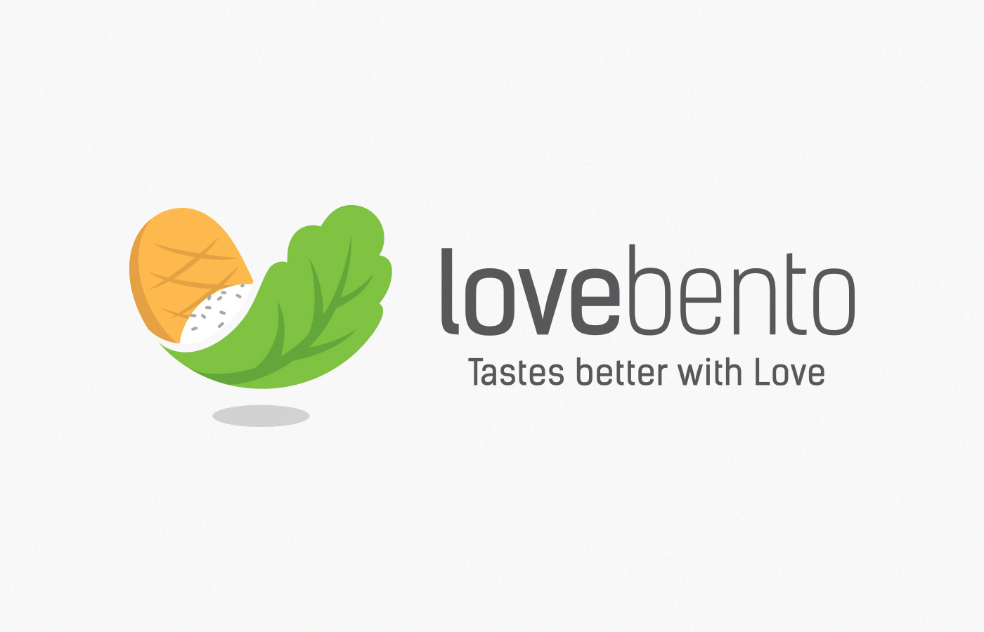
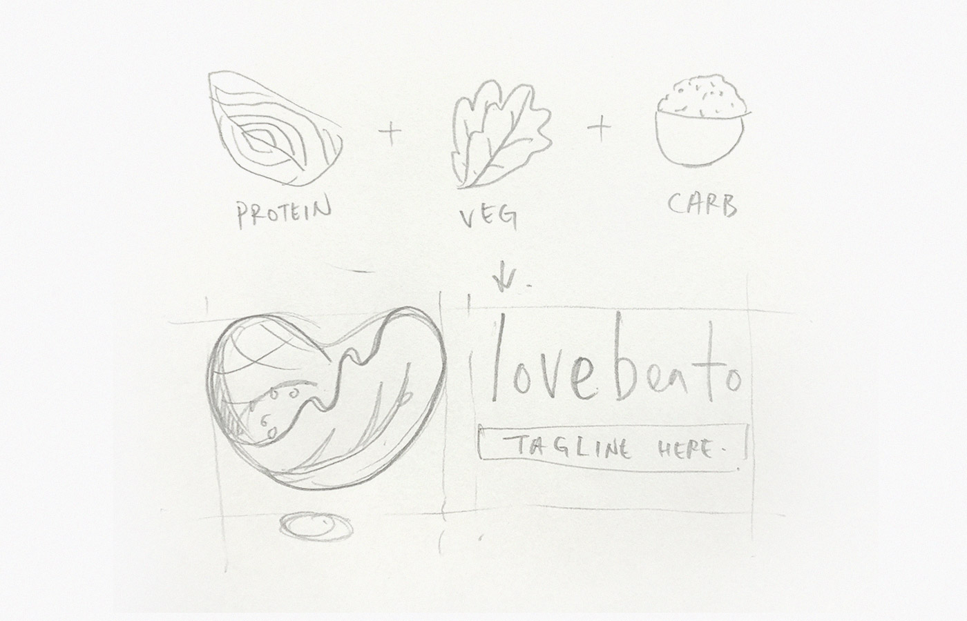
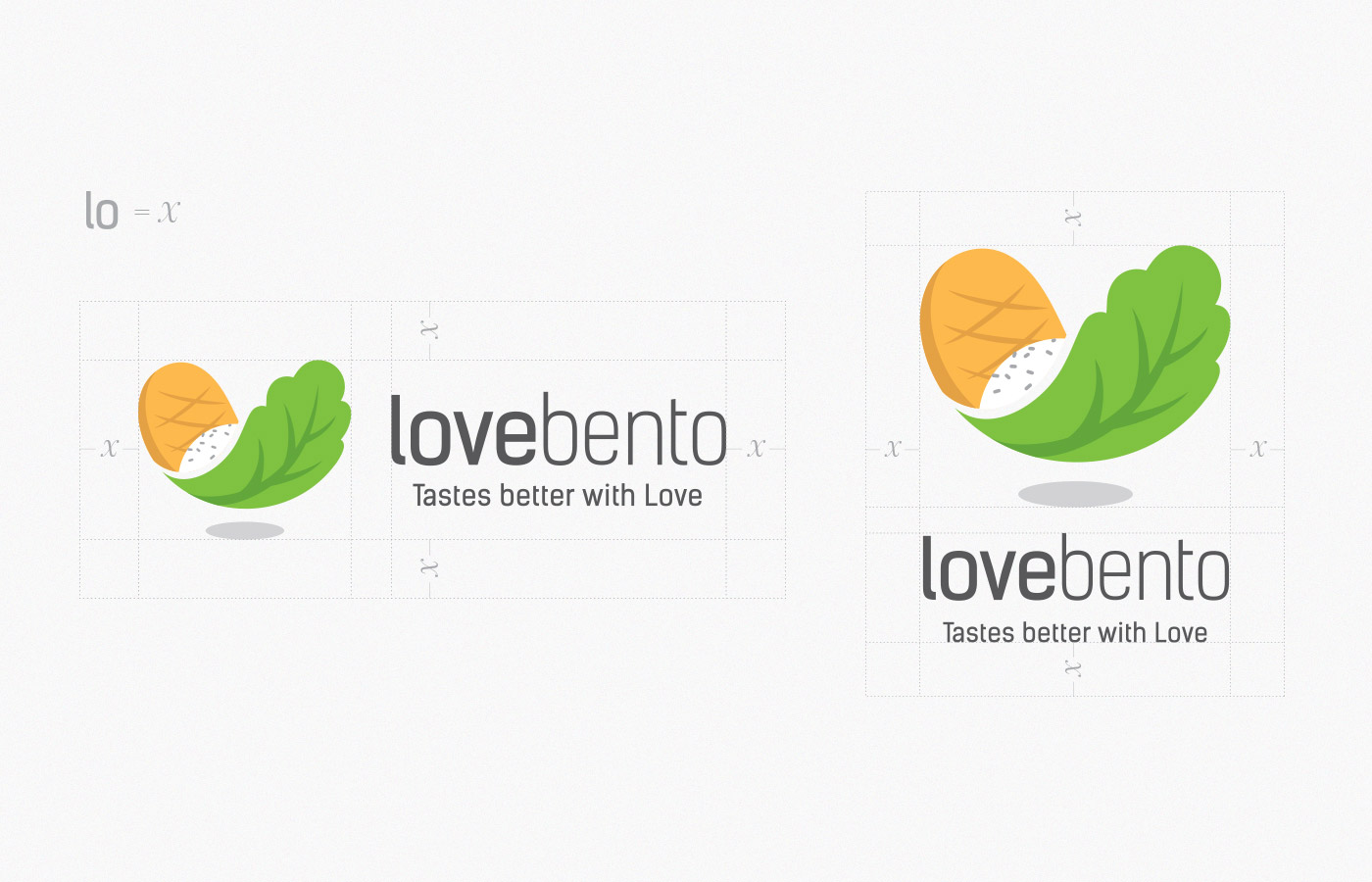
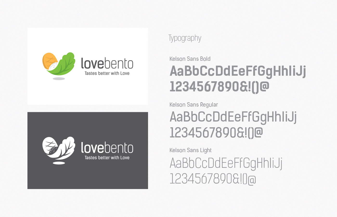
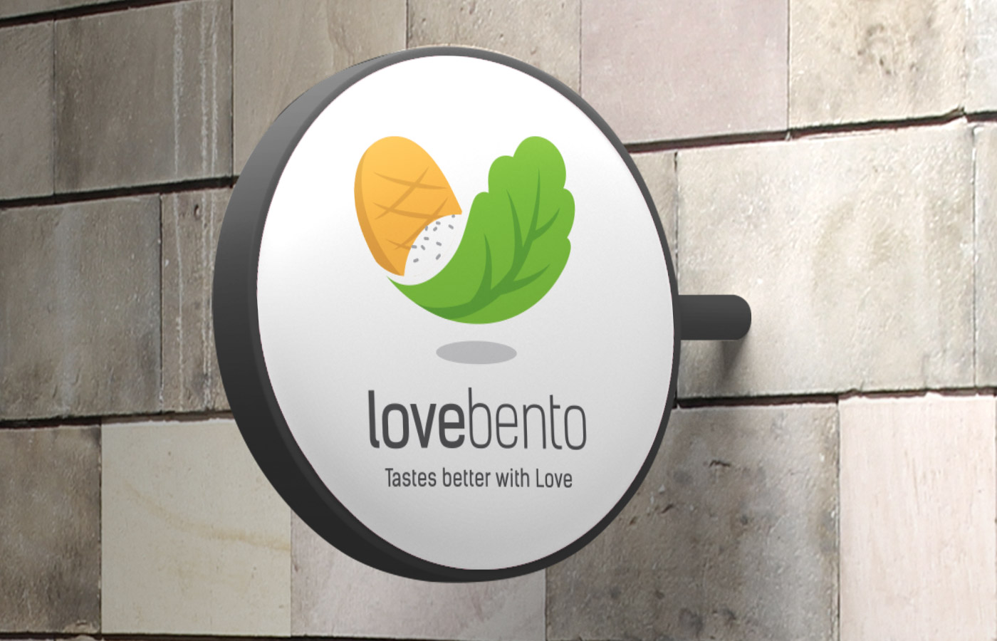
The Love Bento logo is made up of elements of the food offered on the menu i.e. protein, vegetables, carbs. To convey the brand’s beliefs that health is wealth, the shape of the logo is meant to mimic yuanbao or gold ingot, a traditional symbol of wealth in Chinese culture. The earthy colours like orange and green are not only colours of vegetables and carrots but colours that represent nature and wholesomeness. The shadow underneath the logo depicts the brand’s dynamism in food delivery.
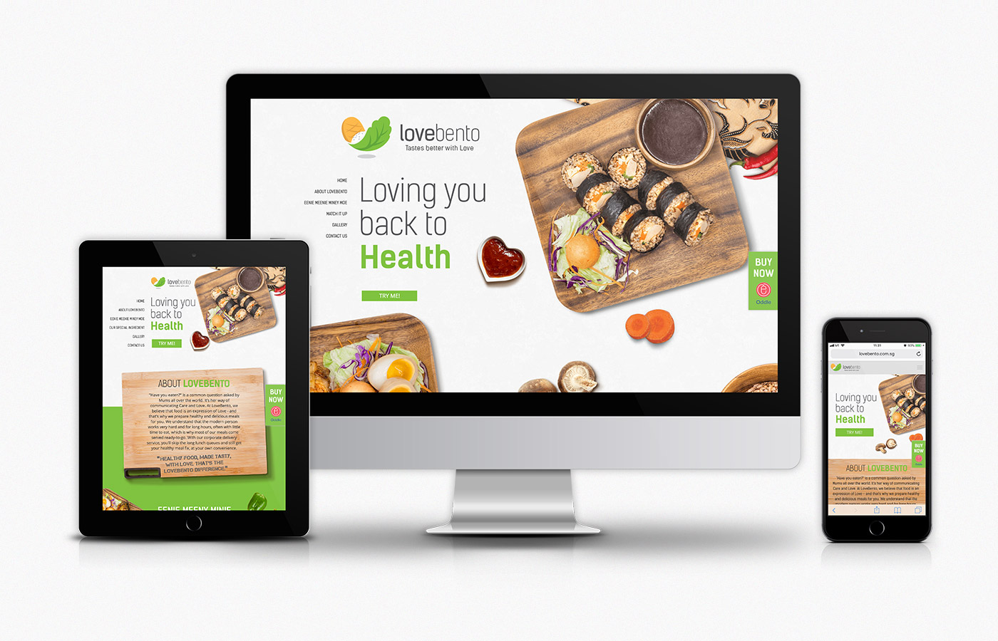
The Love Bento website features an organic design that is not linear or structured. This non-linear design that is also used in the food photography communicates that the food, like its design, is unprocessed and natural.
April 2018
RELATED PROJECTS

Be the first to know
our latest news!