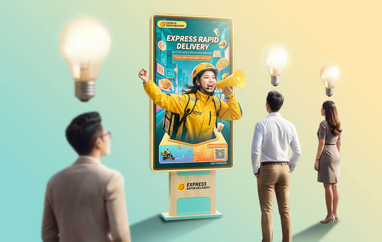
A key visual (KV) is often treated as the starting point of a campaign. It appears across social media, digital ads, outdoor placements, retail displays and presentation decks. Yet its role extends far beyond creating visual consistency.
A strong key visual should communicate an idea before a headline is read or supporting copy is processed. In today’s fast-moving media environment, where audiences make split-second decisions about what deserves their attention, a KV is often the first and only opportunity to make a meaningful impression.
The question is not whether a key visual looks good. It is whether it tells a story clearly enough to be understood within seconds.
Guiding Attention Through Visual Hierarchy
Attention is not given. It is guided.
Every effective key visual leads the viewer through a deliberate sequence, directing them to what they should notice first, second and third. This is achieved through visual hierarchy, where colour, scale, contrast and placement work together to prioritise information and reduce cognitive effort.
Without hierarchy, every element competes for attention. Product shots, headlines, logos, promotional messages and supporting graphics all fight for visibility, making it harder for audiences to identify what matters most. The result is often visual clutter rather than communication.
This principle can also be seen in Mashwire’s Yeo’s NDP 2023 Campaign. While the campaign brought together multiple visual elements to celebrate Singapore’s National Day, the key visual maintained a clear hierarchy through thoughtful composition, contrast and placement. The product remained the focal point, supported by patriotic imagery and festive design elements that reinforced the campaign theme without competing for attention. By guiding the viewer naturally through the visual, the campaign communicated both brand presence and celebration in a way that was immediate, balanced and easy to understand.
Strong composition solves this by creating a clear focal point. Whether it is the product, a central idea or a key benefit, the layout should naturally guide the eye through the visual in a way that feels effortless. When hierarchy is intentional, consumers understand the message more quickly and retain it more easily.
Every Visual Element Communicates Meaning
People process visuals before they process words. Long before consumers consciously read a headline, they have already formed impressions based on colour, imagery, textures and symbols.
This is the principle of semiotics. Every visual element carries meaning.
A warm colour palette may communicate comfort or energy. Natural textures can suggest freshness or sustainability. Rounded shapes often feel approachable, while bold geometric forms may convey strength and confidence. These associations happen instinctively, influencing perception before rational evaluation begins.
However, visual meaning is never universal. Cultural context plays an important role, particularly across Singapore and Southeast Asia, where colours, symbols and imagery may evoke different interpretations. Designing effective key visuals therefore requires more than aesthetic judgement. It requires an understanding of how audiences interpret visual cues within their own cultural and social contexts.
The importance of semiotics can be seen in Mashwire’s Haidilao x Kung Fu Panda 4 Global Retail Activation Campaign. To celebrate Lunar New Year, the campaign combined the globally recognised Kung Fu Panda characters with festive colours, traditional Chinese design elements and playful visual cues to create an experience that felt both culturally relevant and instantly recognisable. Rather than relying on lengthy explanations, the key visual communicated celebration, togetherness and the festive dining occasion through visual symbolism alone, allowing consumers to intuitively connect with the campaign before reading any supporting copy.
The same principle can be seen in Mashwire’s Lee Kum Kee “The Best Feasts Are Made Together” campaign. Rather than relying on product claims alone, the key visual used vibrant food photography, warm festive colours and communal dining scenes to immediately evoke togetherness, celebration and the joy of home-cooked meals. These visual cues communicated the campaign’s central idea before audiences engaged with any supporting copy, demonstrating how thoughtful design can shape perception and emotional connection through imagery alone.
The strongest key visuals do not explain every message. They imply it. Consumers should intuitively understand what a brand stands for without needing extensive supporting copy.
Designing For Three Seconds
Most key visuals are not viewed in ideal conditions.
They appear while people are scrolling through social feeds, passing digital displays, walking through retail environments or driving past outdoor advertisements. Attention is brief, and opportunities to communicate are measured in seconds rather than minutes.
This makes simplicity one of the most powerful design principles.
Every additional graphic element, competing headline or decorative detail increases the effort required to understand the message. While it may be tempting to maximise every asset by including more information, complexity often reduces clarity.
The importance of simplicity was also reflected in Mashwire’s Ocean Health Liver Detox Aid product launch. Introducing a relatively unfamiliar health supplement required the campaign to communicate quickly and clearly. Instead of overwhelming audiences with technical ingredients and functional claims, the key visual centred on a single benefit-led message supported by clean visuals and a clear product focus. This allowed consumers to immediately understand the product’s purpose, even within the limited attention span of social and digital environments.
A similar principle guided Mashwire’s Geniebook Power Up Online Learning Campaign. Designed for digital-first audiences, the key visual needed to communicate the excitement of online learning within seconds. By combining a strong hero visual with a simplified layout and focused messaging, the campaign quickly conveyed both the platform’s educational purpose and its engaging learning experience. Rather than overwhelming audiences with multiple product features, the creative centred on one compelling idea that could be immediately understood across digital touchpoints.
Effective key visuals focus on communicating one central idea. Supporting elements reinforce that idea rather than compete with it. If the visual requires explanation to be understood, it is unlikely to perform effectively in environments where attention is limited.
In fast-moving media environments, simplicity is not the absence of creativity. It is the result of disciplined creative decision-making.
Designing With The Consumer In Mind
The best key visuals are not created by asking, “What do we want to show?”
They begin by asking, “What do consumers need to understand first?”
This shift reflects a consumer-first approach to creative development. Every design decision, from composition and colour to imagery and typography, should help consumers process information quickly and intuitively. Rather than decorating a campaign, the key visual becomes a strategic communication tool that supports understanding, recall and brand recognition.
A campaign’s success is rarely determined by how much is included within a single visual. It is determined by how clearly its central idea is communicated.
A strong key visual does not simply attract attention. It tells a story, shapes perception and leaves audiences with one memorable takeaway.
Because sometimes, one image is all you need to say everything that matters.